.avif)

While some marketing best practices transcend the medium, such as action-oriented CTAs, some are quite specific to the channel, like you don’t add hashtags to SMS messages.
But, today we want to focus on tactics that can be applicable across different marketing channels, especially ones like direct mail. Online elements and design standards can also work for offline designs when used appropriately.
Let’s take a closer look at some marketing best practices when designing landing pages and how those principles can be applied to direct mail campaign creatives.

This point was actually adapted from paper to digital by following formulas used by newspapers for years. No matter if your marketing asset is online or offline, you need an attention-grabbing headline to engage consumers.
You can use numbers for faster processing (like the Mint Mobile example), powerful statements (like the Mint Mobile example saying it’s the best offer of the year), or even using emotional words to get a reaction from recipients.

What action should the viewer take? Online we think of this as filling out a form, downloading something, or completing a transaction. We often fit our digital CTAs on a button so keep the same idea in mind when creating your CTAs for direct mail. Sure, people can’t just click it, but it should be actionable enough they know what to do.
Saylent has a great CTA on this direct mail campaign: Try Bill Pay. It’s simple and straightforward and seems like an easy thing for the recipient to do. Just try it. And, if you do you can earn $10 cash back.
Recommended reading: Best Practices for Direct Mail Calls to Action

There’s a certain feeling you get when you land on a website that has too many elements, popups, or ads. It’s overwhelming. You don’t know what to click or read first. Some direct mail campaigns can be overwhelming when there are too many elements or things aren’t formatted correctly.
Many webpages follow the Z-shape layout or F-shaped layout and those design principles can be copied over to direct mail. These layouts are scannable and follow our natural eye movements.
Geico follows the F-shaped format and uses bullet points to make a text-heavy letter feel easier to read or scan. Plus, Geico has some great personalization happening on this letter by including the university the recipient just graduated from.

Call-out boxes can quickly draw viewers’ eyes to these elements by having pops of color, images, or bold or colored text. Like how they can be used on landing pages, call-out boxes in direct mail campaigns should house key points, quotes, or imagery or icons.
Wayfair uses call-out boxes in its design to highlight specific product categories customers might be interested in.
Colors for web and colors for print can follow the same ideas but you do need to consider how your colors will look in real-life and not on a screen when adding direct mail to your campaigns.
Obviously you’ll want to follow your brand standards and use your colors, but also think about how colors can convey or enhance your message. Such as black denoting luxury or sophistication or green being fresh or natural.
Another thing to consider when thinking about color is the absence of color or text with white space. Make sure to leave breathing room around the other design elements to make it easier for the recipients to scan and understand.
Recommended reading: Bare Bones: White Space in Your Direct Mail Design
There’s a reason we create brand guidelines so there’s consistency when people come across your brand on social media or visit your website. Whether it’s the branded colors, fonts, or style of imagery and iconography, there needs to be consistency in the look and feel in your direct mail marketing campaigns.

A picture says a thousand words so use images on your direct mail just like you use them in web design. Images can help support your messaging, tell a story, or help your customers see themselves using your product or service. Just like designing for the web, you want to make sure your images aren't pixelated nor are they overly saturated. Another option if you don't want to take custom photos or use stock photography? Use icons instead!
United Healthcare does a great job of using its brand colors on this mailer and does a great job of using icons to quickly convey key messages, like being on time and wearing a mask.
When designing a landing page many designers will apply a blur to the design to see if viewers can still tell where their attention should go. Even blurry, the design should direct viewers to important information like the header, CTA button, and images.
When you apply a blur effect to your direct mail creative, can you still tell what’s important or meant to stand out? Do you know what’s a headline and what’s main copy? Can you identify where you should look first? If not, the design or or copy could use some work.
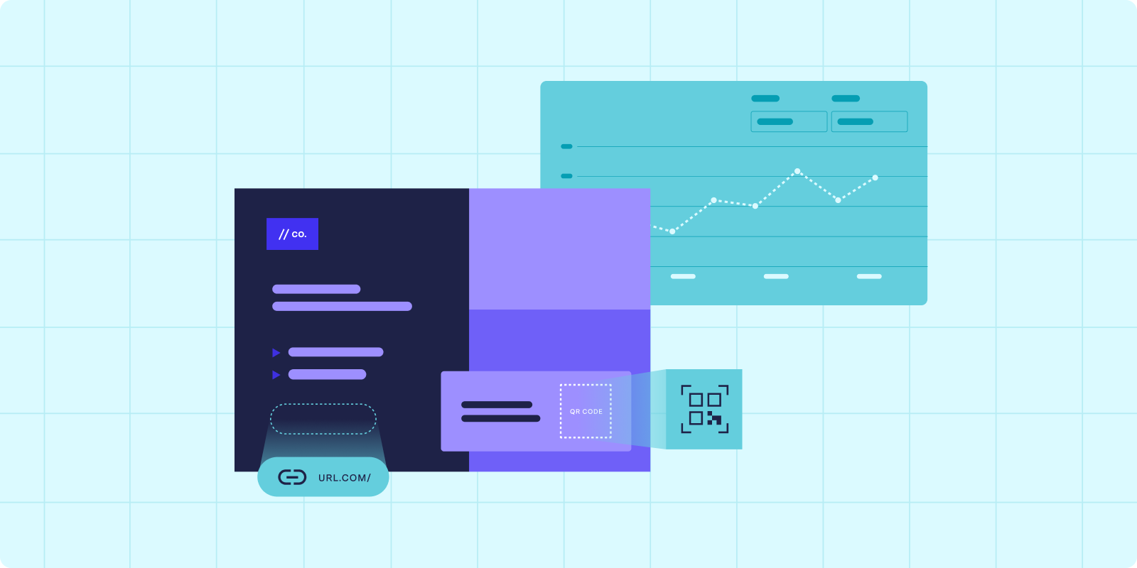
All marketing efforts should be tracked. Whether they're online or offline. Just as you add conversion tracking or pixels to your webpages, you want to make sure your direct mail campaigns can be tracked when customers or prospects take action. That can be done through creating UTM parameters and adding that to URLs you're sharing on the mailer, or trusting your marketing technology and having 1:1 tracking with QR codes or personalized URLs.
When launching a new landing page it’s important to do an A/B split to understand what drives conversions. Do the same with direct mail! Create two versions of your direct mail campaign to see what elements, words, or CTA work best for your audience so you can optimize future direct mail campaigns - as well as optimize its digital counterparts based on what you've learned about your target audience.
Recommended reading
Omnichannel Lead Generation Campaign Checklist
The Perfect Pairing: Direct Mail + Digital
Many of these webpage best practices also work when it comes to designing email marketing campaigns. Learn how to harness the power of both electronic mail and direct mail by listening to episode 3 of the Lobcast Podcast!
FAQs

Answered by: