Ebook
Thumb-stopping mail
30+ creative techniques for earning
attention in the mailbox
Introduction
About three seconds – that’s all the time your mail piece gets to earn a second glance.
The biggest challenge in direct mail isn’t getting to the mailbox on time, it’s getting noticed once it’s there. After months of careful planning, orchestration, and delivery, your campaign’s performance comes down to a single moment. How are you going to make it count?
Standing out in the stack
People aren’t tired of communication. They’re tired of irrelevant communication.
Each day, consumers are bombarded by thousands of ads, messages, and notifications – all competing for the same limited attention. They don’t have the time to carefully read every message they come across. Instead, they do a quick scan before deciding whether to open, save, or toss. Only a fraction of readers ever even make it past the headline. To drive action, your direct mail must capture attention fast enough to leave an impression.

On average, 5X as many people read the headline as read the body copy.
Source: Who’s Mailing What
How does your offer make a consumer’s life easier, better or less expensive? The strongest pieces immediately signal relevance and authenticity. Once you’ve established that value – and given recipients a good reason to believe it – that’s when your direct mail can actually start performing.
The essential elements of thumb-stopping mail
Thumb-stopping direct mail doesn’t try to communicate everything at once. Instead, it communicates with intention.
It sounds counterintuitive, but attention-maxxing your direct mail can do more harm than good. Cramming in too many offers, headlines, and CTAs buries your message and makes your mail easier to ignore. When everything competes for attention, nothing stands out.
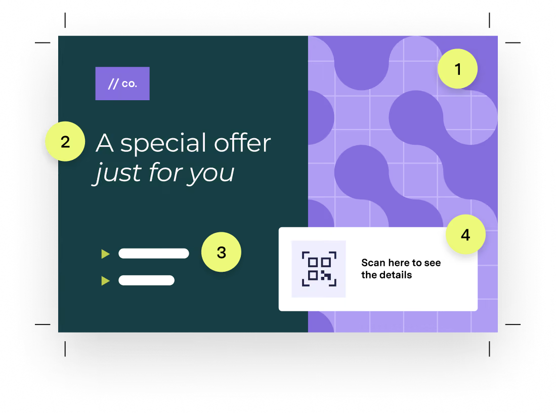
After analyzing more than 1 billion+ mail sends, we’ve identified the essential elements that make direct mail easier to notice, understand, and act on.
Visual
Strong visuals make the difference between capturing attention or losing it. Eye-catching imagery and high-contrast colors stop readers in their tracks and spark an emotional connection, so they’re more likely to keep reading.
Headline
Signal immediate relevance with a bold headline that delivers your core message in just a few seconds, even if it’s the only thing your recipient reads.
Copy
Highly scannable body copy, direct language, and visual hierarchy reinforce the headline, expand your story, and guide the reader through your proof points.
CTA
A strong, simple call to action paired with multiple response paths, like QR codes, URLs, or a phone number, make it easier for recipients to convert while improving direct mail tracking and attribution.
Thumb-stopping mail in action
From headlines that instantly communicate value to layouts that guide reader interaction, the following real-world examples demonstrate how strategic direct mail design reduces friction, builds trust, and encourages action. Here’s how.
Anchor value first
Before anything else, your mail piece needs to prove its value by answering this question for readers, “What’s in it for me?”
What to try:
- Lead with benefits: Lead with a concrete benefit that aligns with your audience’s primary motivation.
- Prioritize relative value over absolute value: People rarely know if a number is good or bad in isolation. The strongest direct mail pieces provide context, such as sharing estimated mortgage rates compared to average rent costs in their area.
- Use personalized benchmarks: Ground the message in data that feels specific to the recipient’s market, behavior, or situation.
What works
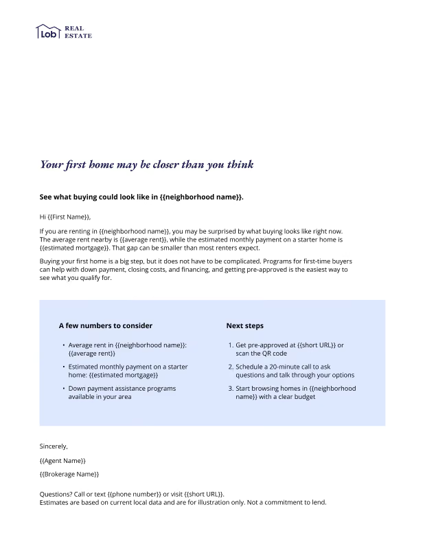
This real estate letter helps renters compare their current reality to a potential future one. By using personalized rent and mortgage estimates from their neighborhood, it shows that buying may be more within reach than they assumed. It also removes a major source of uncertainty by providing local benchmarks and clear next steps, making the path to homeownership feel more tangible and achievable.
Reduce decision making
Is this for me? Is it worth it? What do I do? Every extra question you force customers to answer increases their cognitive load and creates extra work for them.
The best pieces eliminate this friction by answering these questions right away – before recipients move on to the next thing.
What to try:
- Curate instead of overwhelm: Organize products, services, or offers into relevant categories so recipients don't have to sort through endless options.
- Employ multi-channel CTAs: Give readers one obvious next step and make it accessible across channels, whether that's a QR code, URL, phone number, or store visit.
- Include time-bound language: Include offer codes with an expiration date so recipients understand when they need to act.
What works
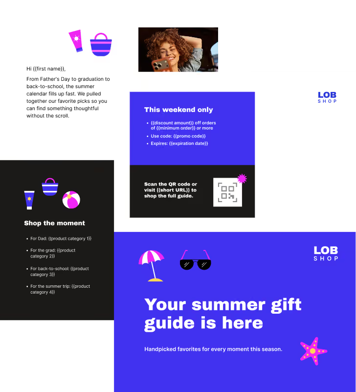
This high-performing seasonal gift guide collapses the decision window by quickly communicating everything essential at a glance. Rather than asking recipients to browse an entire catalog, it organizes recommendations around common summer occasions, making it easier to find a relevant gift. Clear pricing, a limited-time offer, and multiple response options further reduce friction by helping readers quickly understand what to buy, why to buy it, and how to take action.
Be specific
Consumers are naturally skeptical. Vague claims get ignored. Earn their trust with specificity. Numbers clarify your claims and create credibility.
What to try:
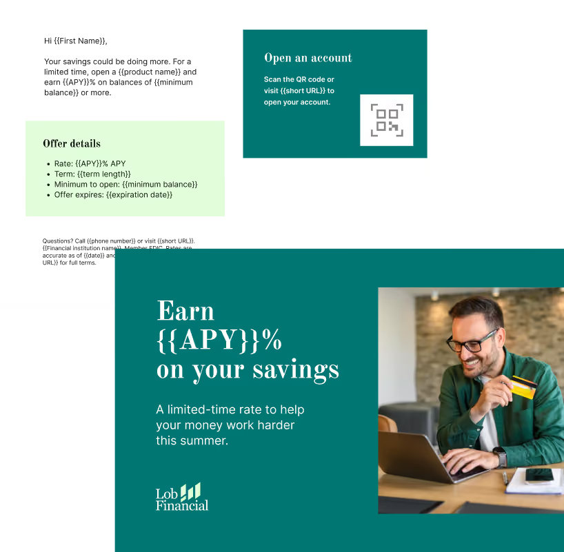
- Lead with specific values that matter most: Make the core offer impossible to miss by putting details, such as the APY in this example, front and center.
- Answer key questions upfront: Include details like rates, minimum balances, terms, and deadlines so consumers can quickly evaluate the offer.
- Make details easy to scan: Group key offer information into a dedicated section so recipients can compare and understand the value at a glance.
What works
In this example, “Earn {{APY}}% on your savings” makes the value immediately clear. Instead of relying on vague promises about growing savings, the piece leads with a specific, measurable benefit and reinforces it with the details consumers need to evaluate the offer. By clearly presenting the rate, minimum balance, term length, and expiration date, it helps recipients make an informed decision without searching for additional information.
Establish visual hierarchy
High contrast. Bold colors. Large typography. Negative space.
Strong hierarchy goes beyond a list of benefits. It’s about prioritizing information and creating a clear visual path for readers from the moment they interact with their mail.
What to try:
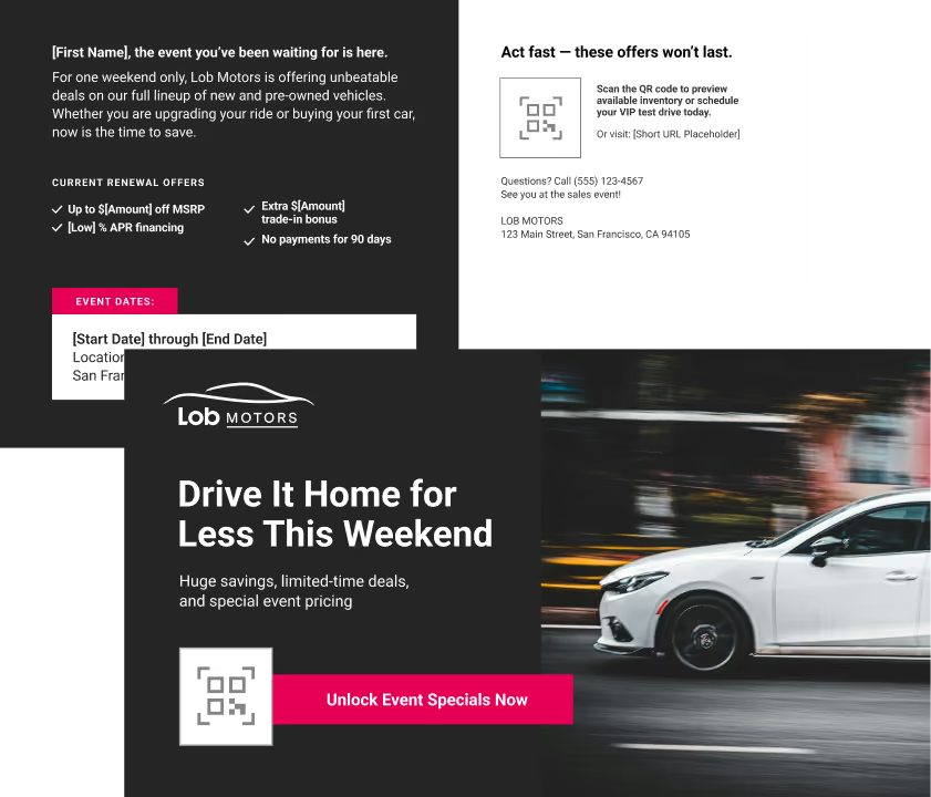
- Create a single entry point: The oversized headline immediately establishes the primary message, helping recipients understand the offer before they engage with any supporting details.
- Match emphasis to value: Reserve the strongest visual treatment for the information most likely to drive action, while secondary details support the decision without competing for attention.
- Sharpen the contrast: Leverage dark, light, and accent colors to help specific information stand out.
What works
This sales event postcard doesn't treat every element equally. Through typography, contrast, and spacing, it directs readers' attention to the most important information first and lets supporting details reinforce the message. The result is a mail piece that can be understood in seconds, even by recipients who are only scanning.
Balance emotion and logic
The highest-performing direct mail pieces use emotion to capture attention and logic to convert it.
What to try:
- Make an emotional appeal: Open with an emotional hook and then reinforce it with quantifiable benefits.
- Use real outcomes: Use tangible benefits to prove how your offer will make your reader’s life better.
- Deliver a timely message: Target your audience with a reminder that creates urgency and personal relevance.
- Make next steps easy: Bulleted steps and clear CTAs make it easy to take action across devices.
What works
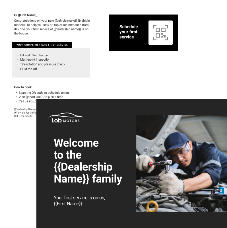
This automotive postcard pairs a personal milestone with a practical benefit. The welcome message creates an emotional connection by recognizing a recent purchase, while the complimentary service offer gives readers a concrete reason to engage. Together, they make the communication feel both thoughtful and useful.
Direct the flow
The direct mail format you use isn’t just aesthetic – it controls the way your brand’s entire story unfolds.
What to try:
- Make it a multi-sensory experience: Experiment with different textures, printing techniques, and dimensional folds to give your mailer a premium feel.
- Try a modular layout: Improve browsing with an engaging layout that invites readers to explore at their own pace.
- Build trust with copy: Detailed, but easy-to-scan messaging adds legitimacy and inspires trust.
What works
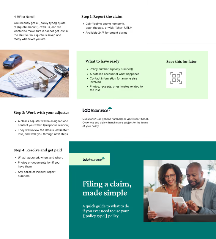
This self-mailer uses its format to control when and how information is revealed. Rather than presenting everything at once, it breaks the claims process into manageable steps, helping readers build understanding as they move through the piece. The result is a complex topic that feels approachable instead of overwhelming.
Make it easy to act
One CTA = one opportunity. Multiple CTAs can’t be missed.
The most successful campaigns don’t rely on just one CTA – they layer them strategically. Multiple CTAs make it easy for recipients to take action however they prefer.
What to try:
- Give people options, not decisions: Offer a few ways to respond, like scanning, calling, or visiting a URL, but make sure they all lead to the same next step.
- Pick up where they left off: If someone already got a quote, abandoned a cart, or started an application, make your CTA about finishing, not starting over.
- Tell them exactly what happens next: Whether they'll review a quote, schedule an appointment, or claim an offer, remove the guesswork before they take action.
What works
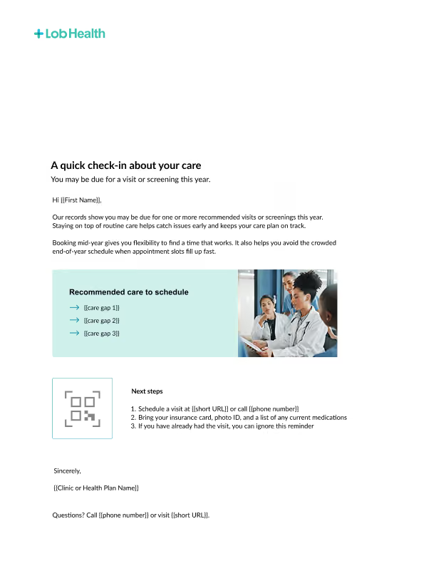
This example leverages the sidebar to make its “Next steps” CTA section stand out. The QR code, campaign URL, and trackable phone number allow recipients to convert via their preferred channel.
Reduce friction with familiarity
Recognition changes the way recipients view your mail. It becomes an invitation instead of an interruption. Starting with an existing relationship or an established brand gives your mail the head start it needs to get attention.
What to try:
- Use dynamic personalization: Instead of sending generic mail, use a data-driven approach to personalize each piece. Even though this requires more setup and production effort, it pays off with higher engagement and ROI.
- Send trigger-based mail: Go beyond basic details by sending timely mail that mirrors your customers’ recent behavior.
- Include branded elements: Incorporate consistent logos, colors, and visuals in your piece so readers instantly associate it with your brand.
- Keep it warm: Use language like “as a customer” or “based on your account” to reduce skepticism and build familiarity.
What works
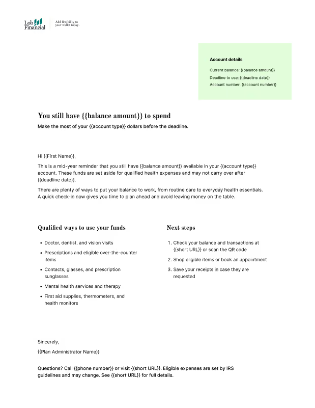
This letter signals an existing relationship and hits both logic and emotion. It lowers reader resistance by positioning the communication as a valuable opportunity vs. a sales pitch.
Create urgency
Urgent CTAs tend to get a bad rep. Phrases like “ACT NOW” and “LIMITED TIME ONLY” tend to sound forced and manufactured, driving recipients away.
Subtle urgency works differently by tying deadlines directly to your offer so they inform without adding pressure.
What to try:
- Tie urgency to the value, not the CTA: The strongest deadlines are connected to something recipients could lose, like a discount, quote, rate, or bonus, not just an arbitrary end date.
- Make the window feel real: Specific dates, expiration times, and offer periods feel more credible than generic phrases like "limited time only."
- Remind people what's at stake: Reinforce what recipients gain by acting now, not just when they need to respond.
What works
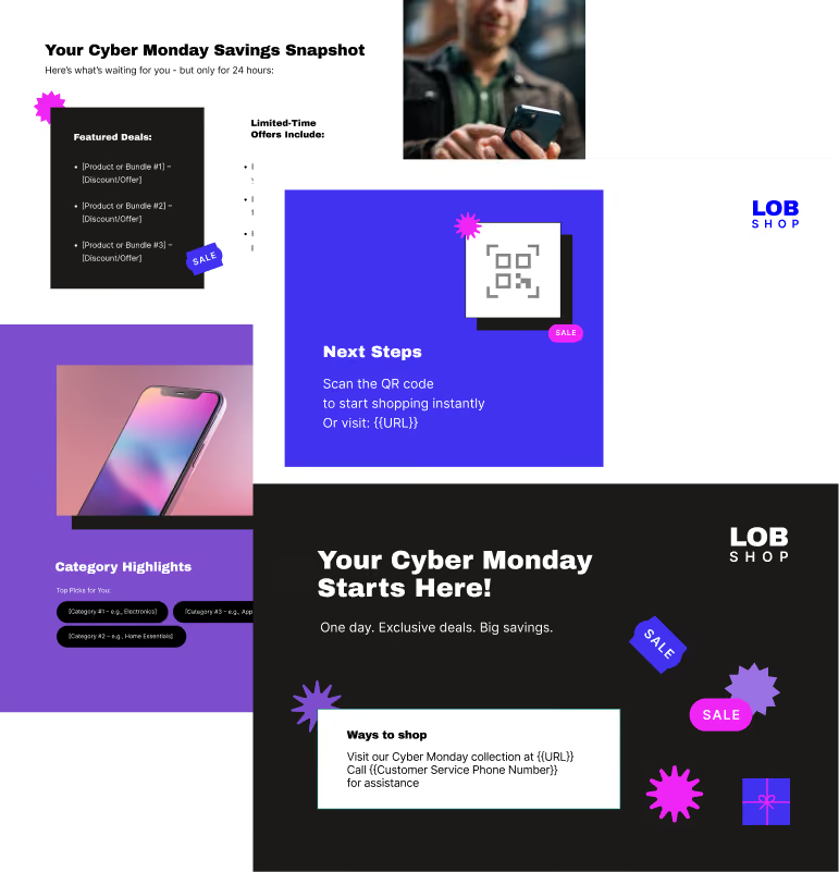
This high-performing seasonal gift guide collapses the decision window by quickly communicating everything essential at a glance. Rather than asking recipients to browse an entire catalog, it organizes recommendations around common summer occasions, making it easier to find a relevant gift. Clear pricing, a limited-time offer, and multiple response options further reduce friction by helping readers quickly understand what to buy, why to buy it, and how to take action.
Relevance gets results
The most effective direct mail campaigns are intentional from start to finish. They’re designed around how people process information: quickly and instinctively. Every element, from the copy to the color choices, should give your readers a reason to stop and pay attention. Because when mail feels clear, valuable, and relevant, performance follows.