Back in the early days of the Internet, placing an order online was a complicated — even scary process.
Filling in your personal information and submitting it (along with payment) to a faceless website was once a rare and tedious task. Few consumers would trust that option over the simplicity of purchasing at a brick-and-mortar store.
These days, it couldn’t be more different. Online shopping is no longer a hassle. It’s a convenience.
Online ordering has become a centerpiece for consumer shopping habits, especially in the wake of the COVID-19 pandemic. According to Forbes, 59 percent of consumers preferred to shop online for the 2020 holiday season.
The tale of this transformation has many threads. One of the most important has become so ubiquitous that it seems mundane: the checkout process. Let’s explore the importance of a great checkout experience and how having one creates an awesome customer experience.
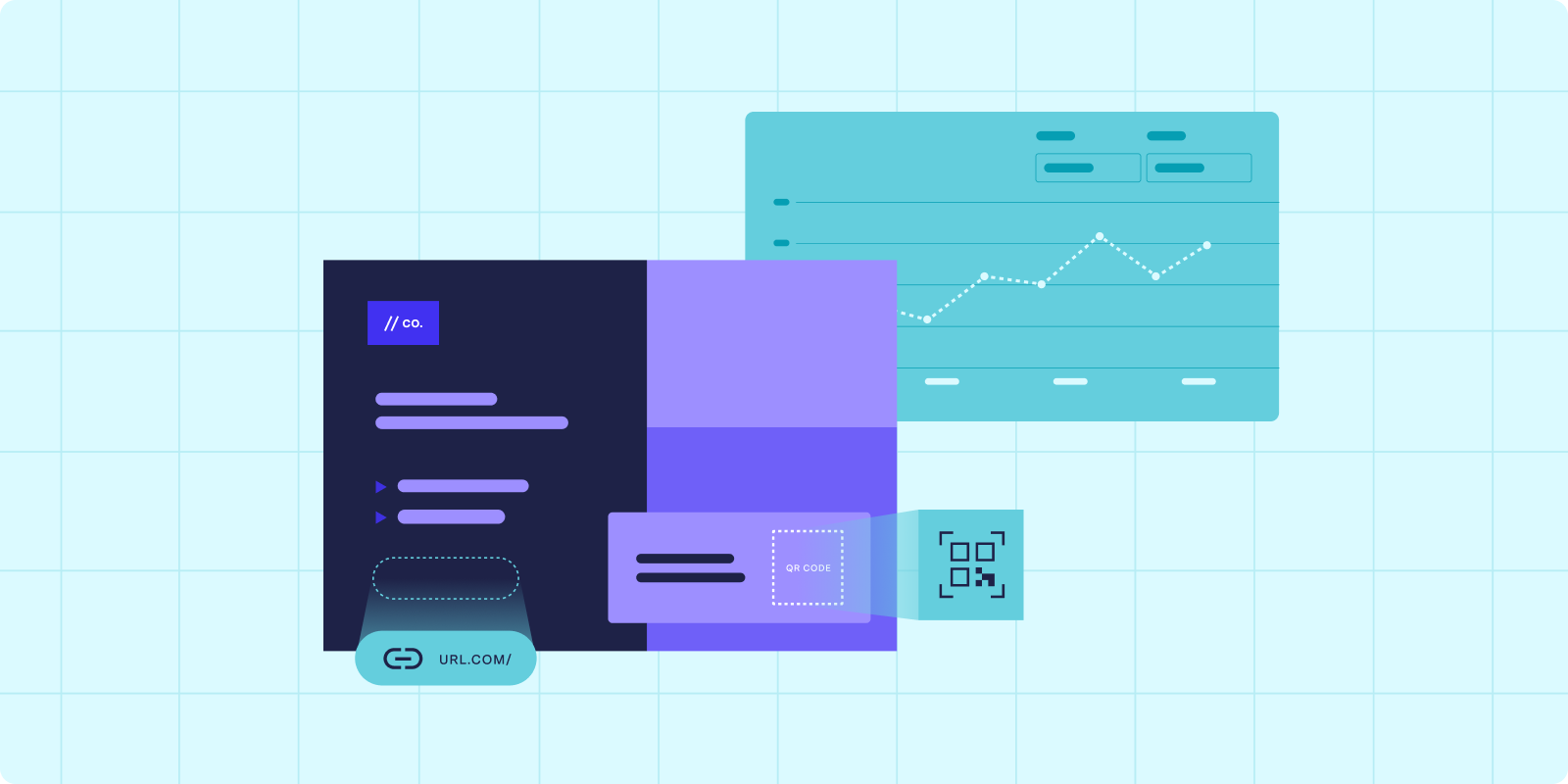
Browsing a modern e-commerce website is a rich multimedia experience. Users go on a tour of interactive product catalogs bursting with high-resolution photos, slick video presentations, and carefully crafted product descriptions.
Until it’s time to check out, the user’s online shopping experience is almost passive. Other than clicking on what they want to see and adding items to their cart, the site asks very little of them.
When they’re ready to place an order, that changes.
The checkout process requires websites to ask a lot from their users. The site forces its potential customers to switch from passive to active participants, requiring them to input and verify several pieces of sensitive information.
Moving the user smoothly through the checkout process is essential for completing an order. If the site suffers from poor performance, if the user interface (UI) has design issues, or if technical errors cause frustration during the process, a potential sale can quickly turn into a disgruntled complaint.
E-commerce sites have adopted various technologies, UI, and user experience (UX) best practices that make the transition from passively shopping to actively ordering as seamless as possible.
On the surface, it might seem like the checkout process hasn’t evolved much from the Web’s early days. After all, we’re still asking for the same information using more-or-less the same input forms.
Most of the factors streamlining and simplifying the checkout experience are relatively subtle. If you’re not looking for them, you may never even know they’re there. That is their purpose: to keep your attention firmly fixed on finishing your order without distraction.
Your average e-commerce site has no shortage of eye candy. Pages typically include plenty of photos, an abundance of product information, and extensive product recommendations.
Placing all this content on the screen is excellent for browsing shoppers. But when it comes time to place an order, the multimedia circus becomes one giant distraction.
Many e-commerce sites serve a stripped down version of their interface that removes extraneous layout elements, hides ads and product recommendations, and clearly presents the input forms necessary to complete the checkout process.
The checkout process asks the user for heaps of information. To complete checkout, a user needs to:
For some sites and services, there may be even more additional steps, such as signing up for an account or verifying the purchase using a security method like a PIN or two-factor authentication.
Some companies have streamlined the modern checkout experience to the point that reading this list of six steps probably felt like more work than placing an order on your favorite e-commerce site. Developers behind checkout experiences have realized that the most effective way to ask consumers for this information is in stages.
Companies often divide the checkout experience into at least four distinct steps, represented as different pages:
Chunking the checkout process creates a natural flow that delivers consumers smoothly through the checkout without feeling overwhelmed.
Instead of asking for everything at once, the checkout experience should ask consumers to input their information in bite-sized chunks. Customers can always do one final review of their information at the end.
As users input their information to complete an order, it’s an excellent idea to assist them as much as possible.
Browsers and devices already heavily assist users, auto-completing text and auto-filling forms. Similarly, e-commerce websites can implement some automated systems to help users input their information during checkout.
Some of the most common means of assisting user input include:
Developers must question every checkout flow element’s when, where, and why. Of particular interest is the humble zip code. Checkout systems sometimes ask for the zip code upfront, sometimes as early as the cart page.
Asking for the zip code this early seems to break the flow of the checkout process. The site isn’t ready for the user’s shipping information, so why ask early for this one piece?
The website can calculate a shipping estimate and determine taxes using the customer’s zip code. Asking early for the zip code enables the e-commerce site to be transparent about the total cost the user can expect to pay. This transparency prevents sticker shock when the customer reaches the confirmation page and discovers unanticipated taxes and shipping fees.
If shipping costs are high, asking for the zip code first may be the way to go. However, if the platform offers free or low-cost shipping, this information may not be relevant enough to justify disrupting the checkout flow.
Questions of when, where, and why include a checkout element are often nuanced — even controversial. There is no one-size-fits-all solution for zip codes, so developers must innovate solutions that meet the unique demands of their checkout experience.
Part of defining best practices is learning what not to do. Despite the checkout experience becoming more streamlined and simplified, it’s best to avoid a few common UI/UX elements that frustrate the checkout process. Let’s explore a few.
As a general rule, if the user doesn’t need an account to complete their order, a website shouldn’t ask them to register one.
Forced registration and lack of a clearly labeled “guest checkout” option are artificial barriers to placing an order. While certain products and services require the user to have an account as part of the product or for regulatory reasons, creating an account is an unnecessary extra step for most orders.
If a site requires a user to create an account, it should use simple and transparent password requirements. While it is a best security practice to require somewhat complex passwords, websites that take their password requirements to the extreme often frustrate their users more than improve security.
Ensure to list all password requirements at the input stage. Better yet, provide a real-time validation method that checks the user’s password against the standard and immediately lets them know if there are any issues.
Many e-commerce sites opt to show an estimated delivery speed instead of providing an estimated delivery date. You might find a retailer advertising its delivery speeds: “Order now and receive within 2-3 business days.”
Contrast this with a site that offers estimated delivery dates: “Order now and receive between September 5 and September 8.” Now the customer has a definite idea of when to expect their package.
Delivery speeds tend to be less accurate and highly generalized. The delivery speed rarely takes into account distance or other factors that might complicate delivery.
An estimated delivery date provides a more concrete and accurate estimate. It leaves much less room for misinterpretation on the customer’s part. The customer may wonder what exactly “2-3 business days” means and when that clock starts ticking relative to their order.
Though it may seem rather mundane, the checkout process is ultimately one of the most essential elements of any e-commerce website. Companies shouldn’t take their checkout process for granted but rather make it a core focus as it directly impacts revenue.
Now that you know a few different aspects to identify, scrutinize the checkout process the next time you place an order on another website. Are they using Luhn validation for your credit card number? Do they break the checkout process into stages? Does a handy address autocomplete system assist you with your input?
You’ll quickly develop an eye for spotting checkout best practices. Maybe you’ll even innovate a best practice of your own.
Learn the benefits of automating intelligent direct mail in our eBook, Modernizing the Direct Mail Process. You’ll get a deeper understanding of how automation can transform your direct mail operations, and give your campaigns greater speed and personalization.
FAQs

Answered by: